| Tweet |

Overview
When building Lightning Components, its highly likely that you will be aiming to support multiple form factors - tablets, phones and maybe even desktops. In order to achieve this, Responsive Web Design techniques need to be employed (for an overview of Responsive Design and an example of achieving this using Visualforce and the Bootstrap framework, see my post in the Salesforce Developers Technical Library).
When using a framework such as Foundation or Bootstrap, its simply a matter of using the appropriate Lightning component, as described my earlier post on Lightning Components and JavaScript Libraries. Keeping the styling with the component presents a little more of a challenge.
Styling Lightning Components
Styling Lightning components is well documented, and involves adding styles to the component bundle. Here’s an component that renders a case, generating two fields per line through use of CSS floats.
Component:
<aura:component >
    <aura:attribute name="case" type="Case" description="Case to display" />
	<h1>
        <ui:outputText aura:id="caseNum" value="{!v.case.CaseNumber}"/>
    </h1>
	<div class="caseFieldLeft">
        <label>Subject: </label>
        <ui:outputText aura:id="subject" value="{!v.case.Subject}"/>
    </div>
	<div class="caseFieldRight">
        <label>Created: </label>
        <ui:outputDateTime aura:id="created" value="{!v.case.CreatedDate}"/>
    </div>
	<div class="caseFieldLeft">
        <label>Priority: </label>
        <ui:outputText aura:id="priority" value="{!v.case.Priority}"/>
    </div>
	<div class="caseFieldRight">
        <label>Status: </label>
        <ui:outputText aura:id="subject" value="{!v.case.Status}"/>
    </div>
</aura:component>
Style:
.THIS.caseFieldLeft {
    padding: 2px 4px 2px 2px;
    width: 45%;
    float: left;
    clear: both;
}
.THIS.caseFieldRight {
    padding: 2px 4px 2px 2px;
    width: 45%;
    float: right;
}
h1.THIS {
    padding: 4px 2px 4px 2px;
    font-size: 1.5em;
    clear: both;
}
For the sake of completeness, here are gists for the containing Lightning App, JavaScript Controller, JavaScript Helper and Apex Controller.
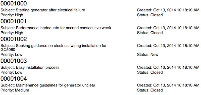
Using this component to render a list of cases results in the following:

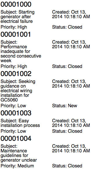
which is readable, if not exactly easy on the eye. However, when rendered on a phone sized viewport the experience is not so good:

The Subject in particular isn’t really readable, and ideally I’d drop down to a field per line.
Adding Media Queries
Generating a field per line is simply a matter of adding a media query that takes effect for smaller devices - below is an example which does this for devices with a width of 980px or less:
@media all and (max-width: 980px) {
    .caseFieldLeft {
	    padding: 2px 4px 2px 2px;
	    width: 100%;
	    float: none;
	}
	.caseFieldRight {
	    padding: 2px 4px 2px 2px;
	    width: 100%;
	    float: none;
	}
}
As of May 2015 there’s one problem using this - the Style element of the component bundle won’t accept media queries. I’ve tried quite a number of combinations which always end up with the same result - a parse error.
Update 20/08/2015
The media query syntax is now supported in Lightning Component style elements (and may have been since the Summer 15 release I guess - this is the first chance I've had to revisit). Simply use the same style names that aren’t subject to the media query (remembering to include the .THIS to namespace to the component) :
@media all and (max-width: 980px) {
.THIS.caseFieldLeft {
padding: 2px 4px 2px 2px;
width: 100%;
float: none;
}
	.THIS.caseFieldRight {
padding: 2px 4px 2px 2px;
width: 100%;
float: none;
	}
}
and now viewing on a small device is an improved, if not enjoyable, experience!

Hey Bob, I found another workaround. If you wrap everything in the component inside a main div, your media query in the style sheet should work. (make sure you have a space though since it isn't first level anymore)
ReplyDelete@media(max-width: 980px){
.THIS .subjStyle{
width: 300px;
}
}
Bob, as Paige mentioned above, media queries work just fine on the style but you should always have .THIS or the name of the wrapper class as a start point and the reason why it work inline is the same thing. So, just start your selectors with .THIS and you should be good to go.
ReplyDeleteThey work just fine now, but they didn't in May when this blog post was written. Any attempt to use @media threw a parse error. I've updated the post to reflect that this is now supported.
DeleteThey still don't work 100% it seems like. I just posted a question about it on stackexchange. If you want to be on the loop just follow the link bellow:
Deletehttp://salesforce.stackexchange.com/questions/89695/how-to-target-phones-and-tablets-with-media-queries-on-a-lighting-component
This comment has been removed by the author.
ReplyDeleteJust for clarification, the reason why I said it worked before and then I replied saying that it's not 100%, is because it works when you test it on the computer browser while re-sizing the screen, but it fails when testing on the actually devices. Ipads, iphones and galaxy phones seems to share the same break-point of 980px.
ReplyDelete